Tableau Healthcare Dashboard Examples are hard to find on the internet! Healthcare professionals are using data visualization software Tableau to create dashboards that help them make better decisions about the health of their patients. From tracking patient data to monitoring hospital performance, these dashboards are proving to be invaluable tools for healthcare workers. Check out some of these Tableau healthcare dashboard examples below!
10 Tableau Healthcare Dashboard Examples:
- Medicare Advantage STARS Ratings Template by Kuldeep Ram
- Maine Healthcare Utilization: Hospital Inpatient & Outpatient by HSRI’s Population Health Team
- US Healthcare Carriers by Jillian Carlile
- Healthcare Revenue Cycle Management – Denials by Tableau for Healthcare
- HEALTHCARE – Medical Visits – Wait Time Dashboard by Tableau Accelerators
- Diabetes Healthcare by Suresh Mehta
- 2019-nCoV Global Cases (COVID-19 Wuhan) by David Ly
- Vaccinating the United States – Urban Institute by HealthDataViz
- Detecting Frauds in Healthcare by Nishant
- Health Data Breach 2009-2020 by Dennis David
Medicare Advantage STARS Ratings Template by Kuldeep Ram
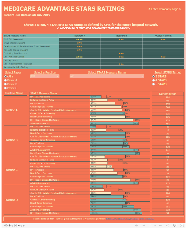
The Centers for Medicare and Medicaid Services (CMS) uses a 5-star rating system to evaluate the quality of care provided by Medicare Advantage plans. Tableau Dashboard can help improve health outcomes by providing clear and actionable data visualizations that make it easy to understand how a particular plan is performing.
For example, Tableau Dashboard can show how a plan’s performance has changed over time, how it compares to other plans in the same region, and what factors are most associated with high or low ratings. With this information, CMS can make informed decisions about which plans to promote and which to penalize. In addition, Tableau Dashboard can be used to monitor progress towards meeting the goals of the CMS Quality Strategy.
Maine Healthcare Utilization: Hospital Inpatient & Outpatient by HSRI’s Population Health Team
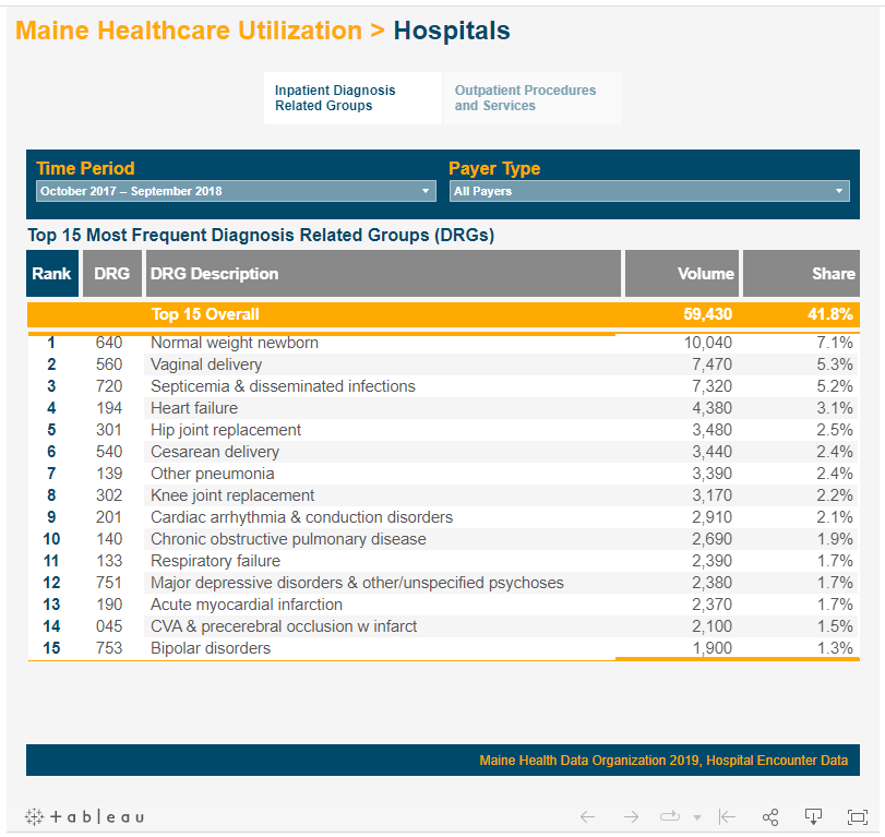
Tableau’s amazing features allow users to interact with data visualization tools to better understand and draw insights from data. Tableau Dashboard can be used to create visualizations of healthcare utilization data, which can help users to identify patterns and trends in healthcare usage.
Tableau Dashboard can also be used to create custom reports and dashboards that can be shared with other users. By using Tableau Dashboard, healthcare professionals can improve their understanding of healthcare utilization and make more informed decisions about how to improve the efficiency and effectiveness of the healthcare system.
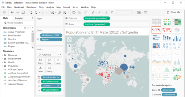
US Healthcare Carriers by Jillian Carlile
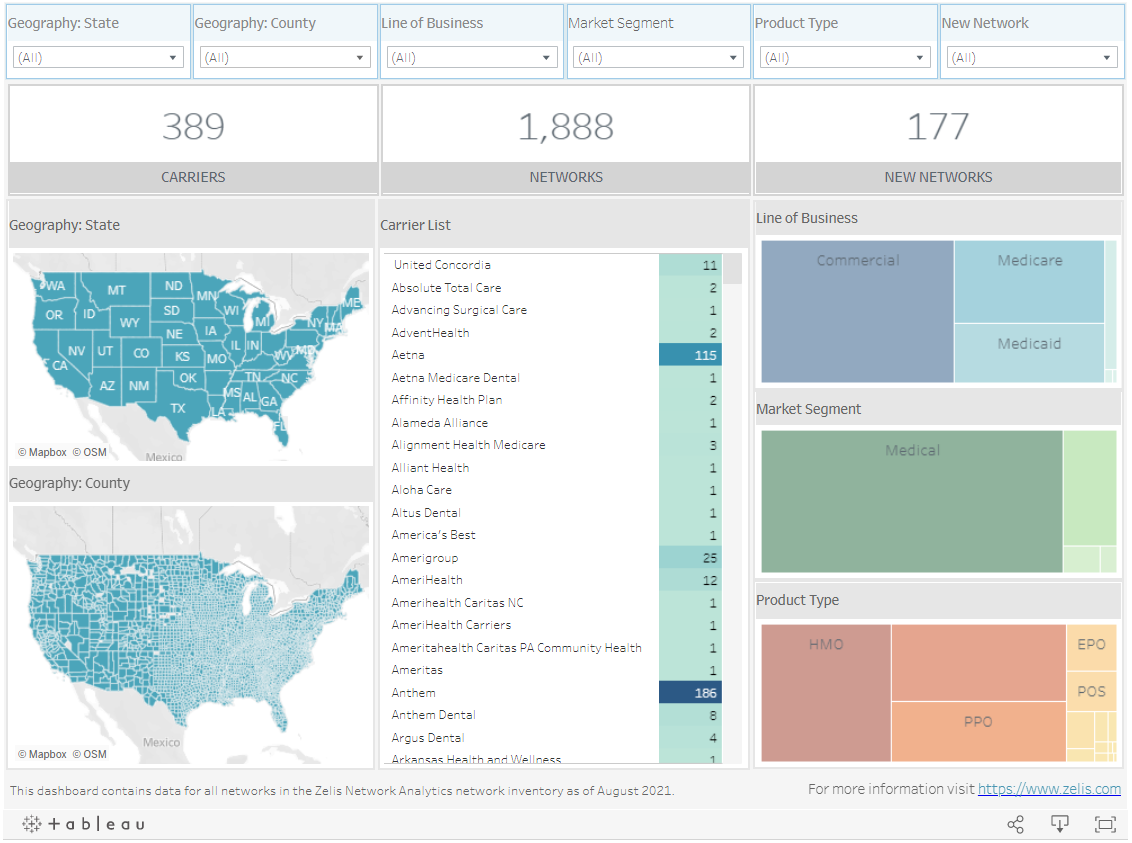
The healthcare landscape is dominated by the Big 5, but there are many other players with Medical, Medicare, Medicaid, Dental, and Vision networks. Tableau is a powerful data visualization tool that can help healthcare providers understand the availability of US Healthcare Carriers. By creating Tableau dashboards, healthcare providers can track carrier performance and identify areas where carriers are not meeting their obligations.
Tableau can also help healthcare providers understand the root causes of Carrier delays and denials. This information can be used to improve Carrier performance and reduce the overall cost of healthcare. In addition, Tableau dashboards can be used to monitor trends in Carrier availability and to predict future needs. Tableau is an essential tool for anyone who wants to improve the efficiency and effectiveness of US Healthcare Carriers.
HEALTHCARE – Medical Visits – Wait Time Dashboard by Tableau Accelerators
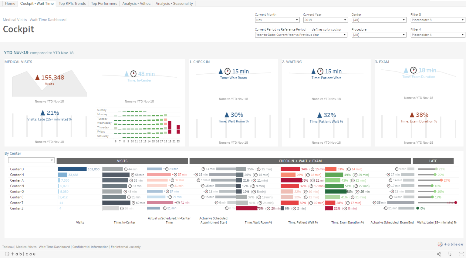
Tableau is the perfect software to assist in the creation of visualizations to help analyze data. Tableau is used by health care organizations to understand patient wait times and improve patient satisfaction. Tableau Dashboard allows organizations to see clearly how long patients are waiting, where the bottlenecks are, and what changes need to be made in order to reduce wait times.
Tableau also allows organizations to track progress over time and compare results across different facilities. By understanding patient wait times, health care organizations can make improvements that will lead to better patient satisfaction. Tableau Dashboard is a powerful tool that can help organizations improve their understanding of patient wait times and make the necessary changes to improve patient satisfaction.
Diabetes Healthcare by Suresh Mehta
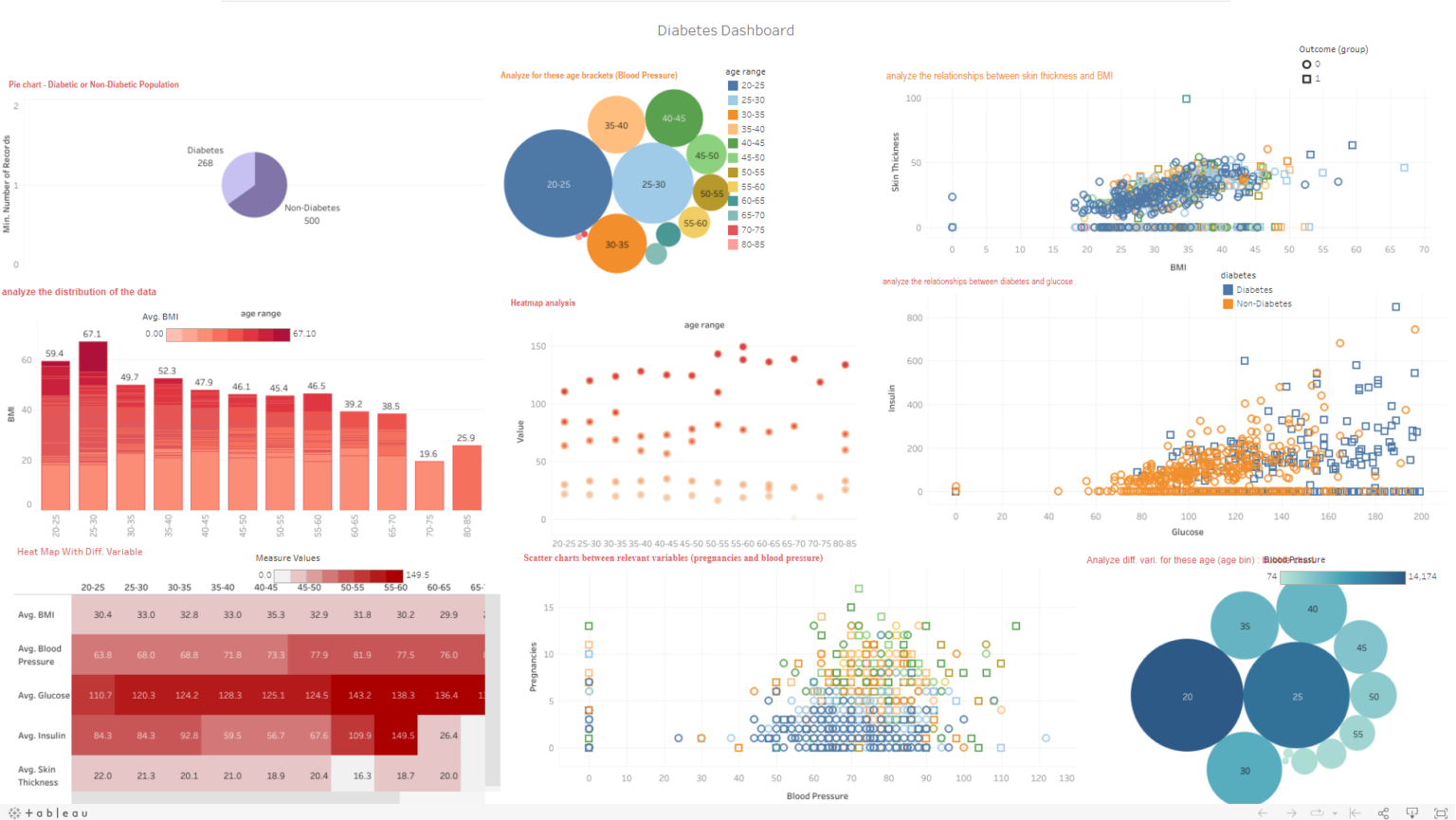
Diabetes is one of the most common chronic diseases in the world, and its prevalence is only increasing. As a healthcare provider, it is essential to have a clear understanding of your patients’ diabetes data. Tableau Dashboard is a powerful tool that can help you do just that. Tableau Dashboard provides a visual representation of your patients’ diabetes data, making it easier to identify trends and potential areas of improvement.
Additionally, Tableau Dashboard allows you to drilling down into specific data points for more detailed analysis. By using Tableau Dashboard, you will be able to better understand your patients’ diabetes data and make more informed decisions about their care.
Healthcare Revenue Cycle Management – Denials by Tableau for Healthcare
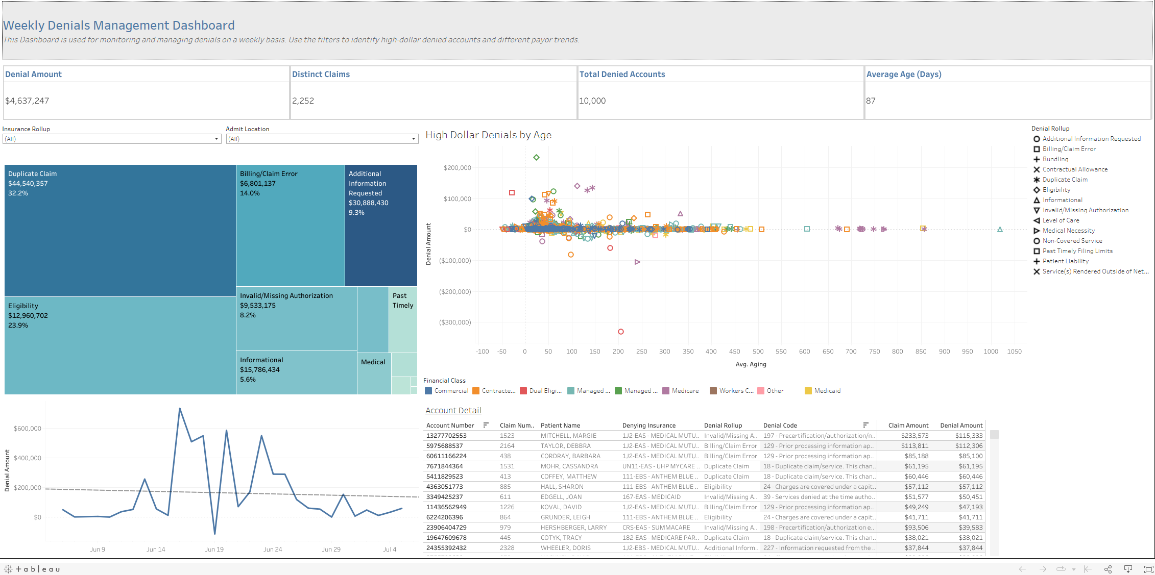
Tableau Dashboards is an analytics tool that provides a clear picture of revenue cycle management and billing within a healthcare organization. Tableau Dashboards makes it easy to understand how charges are entered, posted, and paid. Tableau also allows users to see how denials and allowances impact the bottom line.
Tableau Dashboards can help healthcare organizations improve their bottom line by reducing the time and effort required to manage the billing process. In addition, Tableau Dashboards can help organizations spot trends and inefficiencies in their billing process so that they can be corrected. As a result, Tableau Dashboards is an essential tool for any healthcare organization that wants to optimize its revenue cycle management and billing processes.
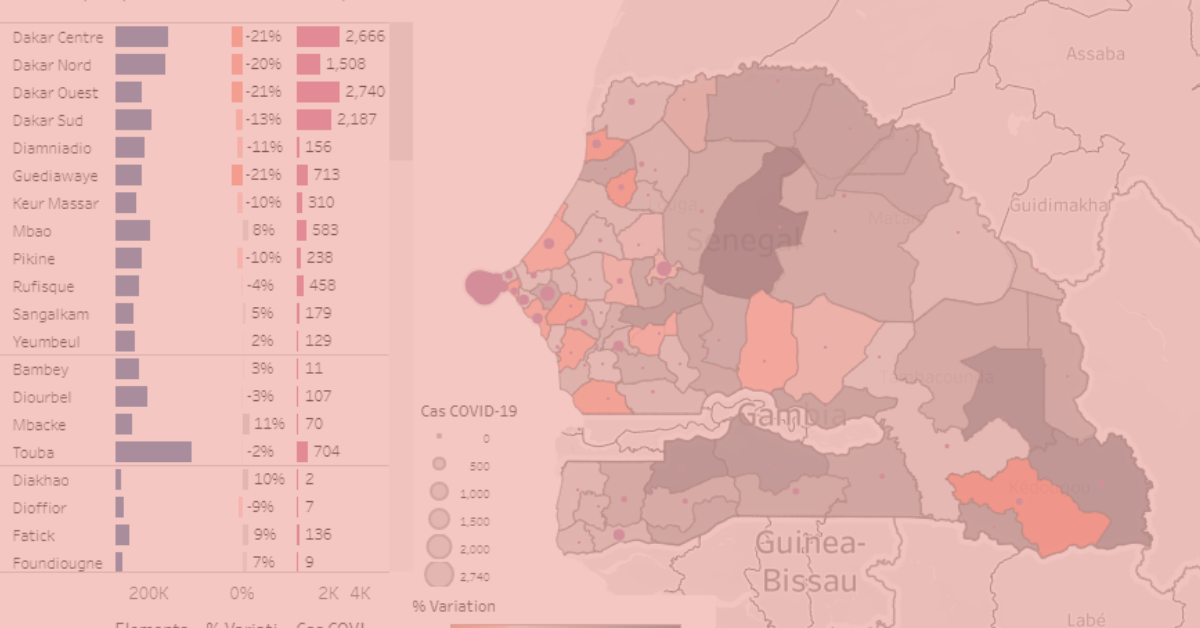
2019-nCoV Global Cases (COVID-19 Wuhan) by David Ly
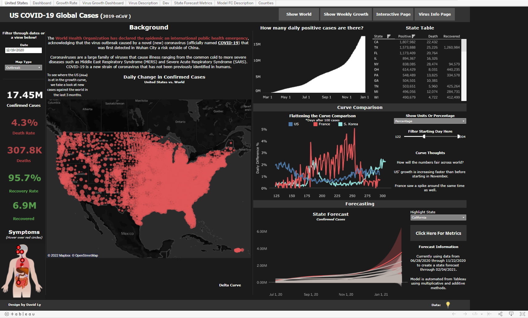
Tableau has become increasingly important in recent years as a tool for helping people to understand data. The Tableau Dashboard is a particularly effective way of visualizing data, and it has been used extensively in the fight against COVID 19. The Dashboard allows users to see the spread of the virus over time, and it also provides information on the number of cases and deaths in each country. This is vital information for understanding the scale of the outbreak and for making decisions about how to respond to it.
In addition, the Dashboard provides information on the demographics of those affected by the virus, which is essential for tailoring response efforts. Tableau is an immensely powerful tool, and its Dashboard is an invaluable resource for understanding viral outbreaks like CO
Vaccinating the United States – Urban Institute by HealthDataViz
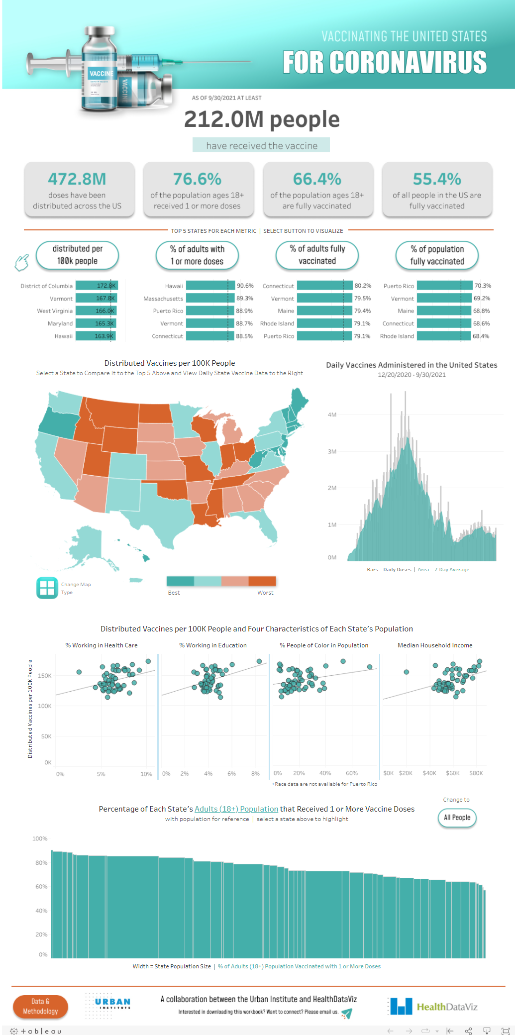
Tableau is a powerful data visualization tool that can be used to track vaccination statistics and better understand vulnerable populations. The Tableau Dashboard allows users to see vaccination rates for different groups of people, as well as how those rates have changed over time. The dashboard also includes information on the number of people who have been vaccinated and the number of people who are still unvaccinated.
This information can be used to identify vulnerable populations and target outreach efforts. The Tableau Story Line is another useful tool that can be used to tell the story of vaccination rates. The story line includes a series of charts and graphs that show how vaccination rates have changed over time. It also includes information on the number of people who have been vaccinated and the number of people who are still unvaccinated. This information can be used to identify vulnerable populations and target outreach efforts.
Detecting Frauds in Healthcare by Nishant
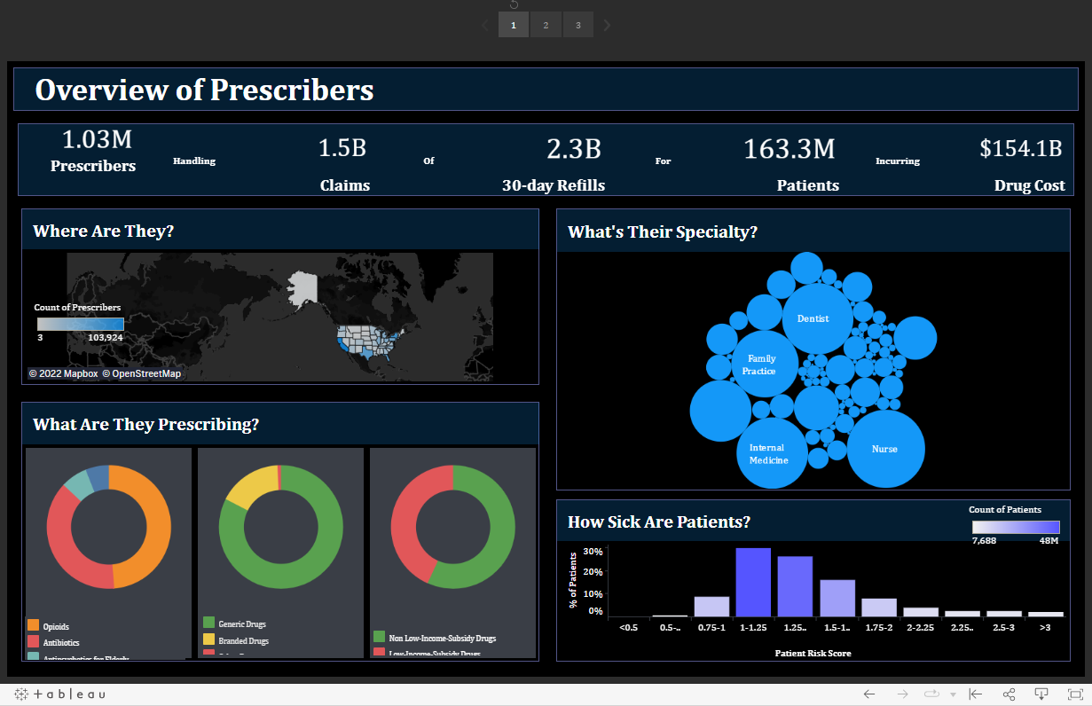
This stunning dashboard is one of the best on our list of tableau healthcare dashboard examples.
Tableau is a powerful data visualization tool that can help to detect fraud, waste, and abuse in healthcare. By creating dashboards that track various data points, Tableau can help to identify patterns and trends that may indicate fraud. For example, a dashboard may track the number of claims submitted by each provider, the average reimbursement amount, and the number of denials. By monitoring these data points, Tableau can help to identify potential fraudsters and prevent them from causing further damage.
In addition, Tableau can also help to identify wasteful spending and areas where abuse is occurring. By tracking the amount of money spent on each procedure, Tableau can help to identify areas where wasteful spending is occurring. Similarly, by tracking the number of patients being treated for a particular condition, Tableau can help to identify areas where abuse is occurring.
Health Data Breach 2009-2020 by Dennis David
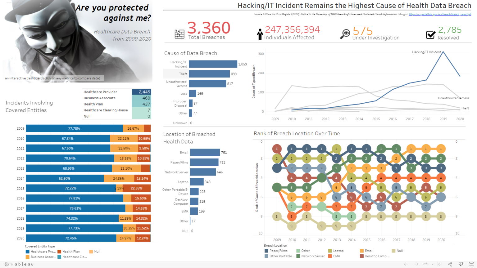
In recent years, healthcare privacy and security have become increasingly important issues. With the rise of electronic health records and the growth of interconnected devices, there is a greater risk of data breaches and cyber attacks. Tableau Dashboard can help to visualize these risks and alert healthcare organizations to potential problems. Tableau Dashboard enables healthcare organizations to see patterns in data breaches and cyber attacks, identify vulnerable points, and take steps to improve security.
In addition, Tableau Dashboard can help to track the progress of security improvements over time. By using Tableau Dashboard, healthcare organizations can more effectively protect the privacy and security of their patients.
These Tableau healthcare dashboard examples have shown you many great ways to get insights from healthcare data. They can be used for many different purposes, such as comparing quality ratings, tracking population health, detecting fraud and abuse, or plotting vaccine data onto a beautiful graph. If you’re interested in learning how to create your own Tableau dashboards, Purchase or eBook “Tableau Bootcamp For Healthcare Professionals ” . With the right tools and knowledge, you can transform your data into actionable insights that will help improve your business.


Recent Comments